Showing posts with label balance. Show all posts

Monday, March 17, 2008

Angelic Balance

This is an older image. Made from an older drawing treated with Photoshop.

I like balance. It makes me feel like everything is going to be okay on some cosmic scale. So this image addresses that balance. Equal parts white-bot and black-bot (one the inverse of the other) arranged in a circle. No doubt inspired by the yin-yang symbol, which I like so much. The idea is not about a struggle or a fight, it's about a balance. For each white there is a black. For each up, a down, etc. The red makes the image pop more and it gives it a bit more energy (it was pretty bland without it).

The bots were cut out of a scan of the first robot image I did. Or at least robots of this type and with this mind-set. I used to draw robots in middle school, but they were nothing like this. Pretty much just a blocky version of the heads I was drawing attached to tank treads with guns in their mouths on the sides of their necks. Ah, middle school. . . so innocent.

Sunday, December 9, 2007

Back in Balance?

It's been a little while, hasn't it. Well that's how it goes, I suppose. I would apologize but no one is reading this.

This image is not strictly a study of contrast. I have always like the yin yang. It's a symbol that looks like what it represents: balance of white and black. It's not a fight or a conflict, it's a balance. There is need of both black and white. And within the black is a little white, and within the white there is a little black. So there is both good and evil in all things. The idea, to me, represents both hope and fear. Hope because there is good in everything. Fear because there is bad in everything. "For all have sinned and fall short of the glory of God" sayeth the Bible. Amen. See? Even God can't get around that one! So check it out.


I like Opart, too. I like the moire effect a lot and it's super easy to get that when you jam a lot of high contrast lines real close together. There is something about this image that really appeals to me on that balance level. I guess because it's easy to get lost in the lines and not notice you're looking a fairly popular and well known symbol. If Everything in The Universe was (were?) perfectly balanced, you would not notice the difference between Good and Evil because they would each contain as much of the other as of itself. So this image takes on that form. If you notice the last complete circle around both "centers" is the same color as its center. So to me the one with the white dot is actually white with black stripes, whereas the one with the black dot is black with white stripes. But a regular yin yang couldn't have the same color dot and blob, or you lose the point of there being black in white and white in black.

I made this image into my desktop.

Saturday, November 17, 2007

Contrast Study #3: OpArt

I like playing with "stroking" an image in Photoshop. (For those that don't know, that's when you make a selection and then create a solid border to that selection, either inside, outside, or centered, at the width in pixels that you decide.) I recently made an action that would select a layer, stroke it at 2 pixels in black, then select the layer with that stroke and re-stroke in white. Then you repeat and you get this:

I think this is real neat. I wish it was real obvious that this was one of my bots to the untrained eye, but I doubt that people who recognize my bots would even see it. Except for the "Robots Are Friendly" around it. I added the text to help point out the robot-ness of the image and to give it a bit of grounding. It was real hard to focus on without that. I might turn this into a sticker one day, but who knows. . . I am lazy after all. I think that if it does become a sticker it would be successful even though it's not obvious what it is simply because it would give people a bit of an optic shock. And with the text there I think some people would think that maybe it means something. It doesn't, but if someone sees it and thinks "This must mean something!" then I'd be extremely pleased.

Tuesday, November 13, 2007

Contrast Study #2: Outlines

This is the second image I did with the blocky-bot. It looks pretty straightforward to me. It's an outline version of the previous image. Duh.


Nothing really new to say about this one that wasn't included in Study #1. I like to work with outlines. I suppose it's another way of making you look at something in a slightly different way. Sort of asking a different part of your brain to define the shape it's looking at? I dunno. This image was the foundation for the one that comes next. Stay tuned.

Sunday, November 11, 2007

Contrast Study #1: Simple Lines

I like to work in black and white and gray. It has to do with the fact that I would like it if things were more black and white, but there is just so much gray that it's hard to understand what the hell is going on sometimes. This is a real simple design, based on the contrast of black of white.


I like the simplicity and I like the contrast. I have done a few things with this same concept. I suppose it's my way of trying to see both sides at the same time. What would this look like white-on-black and what would this look like black-on-white? And which one is "right"? Some will like white-on-black, some will like black-on-white. I need both, it's just easier that way. I don't have to decide anything.

Next installment will be a variation on this same theme.

Saturday, November 3, 2007

A Change of Plans

Originally this was going to be my sketch-blog. It was going to be dedicated to sharing stuff that I've been drawing in my sketchbook and other miscellaneous pieces of paper. But I don't have a scanner yet so it was going to be a while before it got going.

I've started to do more digital work these days. And I'm starting to mess around with my robots in Photoshop and I even made my own robot cursors. So I'm now rededicating this here blog to my digital work. My goal is to post at least one new thing per week, more if the mood strikes.

For those of you who were all excited to see my sketch-blog, just be patient. I'm still going to do that, I'll just be putting it off until I get a scanner. When I have it up and/or running I'll post the address on this blog and link to it.

In the meantime, here's an image.

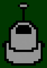
I found a program recently for making my own cursors (see the "Links" section, it's called RealWorld) so I made up a batch of robot based icons and they make me happy. Then I thought that I'd like to make that same lo-bit image, but much larger. I think growing up with Atari and NES nurtured my love of blocky shapes. I'll probably ending up making stickers out of this image. I think it has a real nice feel to it. I just hope that it reads as a robot to someone who hasn't seen my 'bots before. I can never tell what my stuff looks like to people who don't have the benefit of knowing what it's supposed to be first. It's pretty obvious to me that it's one of my bots, but that's because I made it. I think others who have seen my bots would realize that's what it is, but what about those who haven't seen them yet? Oh well, art for Art's sake, I suppose. Of course if Arthur has never seen my bots, he may not know what it is and then he'll say something like "You call that art?"