Showing posts with label robot. Show all posts

Wednesday, February 11, 2009

Matchstick Bot

Remember last time I was talking about how I was drawing with matchsticks? Sure you do! Well here's another one that I did
Again, it's a combination of ink-pen and match-stick. All of the shading is done with burnt matches. I think that I like the treatment of this image better than the previous image, but I like the previous image better than this one overall, this being more of a doodle.

I have been thinking about the white border more lately, though. I hadn't given it much thought in the past, but I'm starting to think it has significance beyond "I like how it looks". For one thing, it gives the image a bit more definition, a space if you will. Something I'm generally searching for is a definition or space. But on another level, that definition is also a sort of a surrounding feeling thingy. Sort of like it's captured in that defined space, unable to move outside of it, where there is (often) color, or shading, or depth, or something more abstract. As such, I've added another tag "border" so I, or you, can look at all those things together and maybe get a better idea as to what's going on with it.

Or maybe it just looks good and it's easy to do.

Saturday, January 24, 2009

Bubble-Bot

I doodled this guy while nursing an incredibly sore back:
[click for to make bigger]

I was lying in bed, watching some Flintstones episodes I had taped off of Cartoon Network several years ago. They were using a lot of circles in their promo stuff and it made me want to work with some circles. Now, I'm not that great drawing circles that are round. They're always pretty oblong and mis-shapen. But what can you do? (Practice? Ha!) This drawing is no exception. But I actually like how the "circles" look in this. I can't explain it, maybe it was the pain pills? But were that the case, I wouldn't still like them, and I do still like them. They just work well with this. The shading turned out pretty nice, too. I keep swearing that I'm going to get my pencils out and start working with them again, but then I go and do something like this with a Bic. I like the shading alot. It's very simple, no gradients or anything, but there are at least 3 distinct levels of shading. The lines are simple, the shapes are very simple, why shouldn't the shading be simple, too?

Maybe that's why I like it so much. Simplicity. Things get complicated sometimes and I just dont' want to deal with all that. Classes started up again so work is busy as hell. Equipment failures, annoyed faculty, annoyed staff, annoyed students. Preparing for upcoming terms while putting out the fires of this one. House is a mess. Sub-freezing temperatures and inadequate heat. My girlfriend in Iraq dumped me. Did I mention the house is a mess? Don't get me wrong. Life is not bad. It's just complicated. I don't like complications. I like simplicity. So that's probably why all the simple shapes and lines and coloring. And the robot's there no doubt because, in my mind, robots have it easy. Do what you're programmed to do, that's it. No deviations. Ah, the life of a robot for me!

Sunday, December 21, 2008

Dots-N-Lines

The drawing bug bit me again recently. Finally. So I drew this:

[click for to make bigger]
I really wanted to do a drawing with the dots n lines (like this one) that had the robot in the middle of all the lines and dots. So I did that part first. Then I drew the box around it to give it a "completed" look. Then I thought that there should be more boxes with more stuff. So I drew the rest of the boxes and then filled them in. First was the one on the bottom right. The original idea was to do some of my columns, but I screwed up in ink so I wound up with what I have there. It's not bad. Next was the self-portrait. Usually I fill in the area around the head, but decided that I was too lazy/impatient so I went with dots. That seems to stick with the theme of the first two boxes (in the order they were drawn). The area up top remained blank for a couple of days, unsure of what should be in there. I knew I wanted a "scene" of some sort. . . but what? Then out of nowhere I decided I wanted to draw a mushroom cloud. They're easy and they look like they mean something whenever you draw them into anything. After the ground and the cloud were done, I thought it would be fun to put a sun in there. It was originally going to be a happy smiling sun, but I messed up the eyes (in ink, of course) and it looked a bit sinister. I figured it must be happy that the earth was finally feeling what it feels ALL THE TIME! I added the flying stickman (always a fun image to me) and the dialogue.

I want to do more with the dots-n-lines with the robot. I like how it turned out. I need to get the pencil set back out and spend some real time on it, make it look really nice.

Tuesday, November 25, 2008

You Thought It'd Be Easy?

Drew this in Colors! while whittling time away at work tonight:

(click for to make bigger)
I've been doodling those lines/circle things for a little while. They seem to fit well with the robots.

I've been missing my girlfriend, who is stationed in Iraq. It's not easy. We both have our difficulties with it and sometimes they collide. Recently they collided pretty hard and it looked kind of bleak for a little bit there. I think it's going to be okay, but it will continue to be hard. I can't wait until she gets back. Anyway, that's what the words are all about. I wanted to draw the 'bot and to draw the dots and lines, that's why they're there. I like that it's rough, too. Times are rough, to an extent, so the 'bot and etc. should look rough, right?

Nothing else really to say about it right now. Watch for more dot-n-line stuff, though. I'm sure it's coming!

As the French say, "Happy Thanksgiving!"

Friday, October 10, 2008

Thing From July

I have no idea what this is all about:

[click for to make bigger]
Pretty cool though, huh? I've been doodling more of those line things that appear above the robots hand in the "fresh fish sticks" panel. I like them. Maybe they're my new thing? I'll have to do some more elaborate ones and see what happens.

I gotta draw more. . .

Tuesday, September 30, 2008

Two Months?

Two months? Really? It's been that long. . . dammit. I really wanted to keep up with this. It helps me to keep drawing. But I lost my computer. It went to the crapper. So while I have a computer, it won't run Photoshop so I have no real editing software. I may have to resort to using The Gimp until I can upgrade. . .

But more importantly, something distracted me. Distracted me from a lot of things. I'm still distracted, but I'm getting used to it. Here, maybe this will explain it in a way:


Yes. I'm in love. And I couldn't be happier about it. She's wonderful and amazing and special and she gets me. Really gets me. I get to be myself with her. Which may explain a bit about why I haven't been drawing so much recently, too. Part of why I draw is to understand myself better, to sort of explain me. But she gets me without all the explanations. . . My art is suffering. Well, a lot of things 'round here are suffering. But I'm getting better. Part of the problem: she's in Iraq now. That really sucks. I'm not depressed but I have some of the symptoms. Especially the lethargy. But I'm getting better! And all this is still way better than the Three Years of Hell I just got out of, so I'm still up!

I'll post more soon, I promise.

Monday, April 14, 2008

Robot-Head-Thing

Just this past Saturday I was interviewed for a local 'zine called "Infolepsy". As a result, I now feel motivated to draw more frequently and to at least maintain status quo on posting to this blog. So I drew this last night.


Whenever I'm stuck for ideas, I draw heads. Human heads, robot heads, dog heads, cat heads. But no shower heads. I don't know that I have ever drawn a shower head, interestingly enough. I may have to change that. Anywho, I was pretty pleased with the doodle, I'd taken some time to do some shading on the 'bot-head and I like the cross-hatching, too. But the background was a bit dull. Now, it was just a doodle, it was never intended to be a Finished Piece Of Art or anything like that, but still I wanted something to make the image pop a little more. So into Photoshop it went, I selected the background and tweaked the Levels and voila! (Which, if I'm not mistaken, is the French word for "viola".) Now there is this.

Interestingly enough -to me anyway- I have done images similar to this one before, with the shapes around the head that don't really define a border to the space, but I have no idea what it's all about. Oh I'm sure there's something about balance in there. There's always something about balance. But I don't know what the rectangles are or the circles are. These circles aren't the "bubbles" I so commonly use, so I don't know what they're trying to tell me. I guess this gives me a little direction for new works: what the hell are the circles and the boxes all about? It can't simply be to make the picture appear more elaborate and meaningful than it really is. Or can it?

Friday, April 4, 2008

Mind of a Man, Heart of a Robot (In Color!)

Well, here it is all in color. I rather like it in color, don't you?


And there you have it. My first hybrid in a long long time. I like to draw something with pencil or pen and then color it on the compooter. Partially because I suck with color. I can't work with paints or pastels or anything like that and get the results that I'm looking for. But with Photoshop, I can tweak the colors until they are just right, plus do some other cool stuff that helps to "complete" an image. Take, for example, the cherry on the cigarette. What I did originally looked just awful. It was a bright red. Had I painted that, there would wind up being huge gobs of paint in that area and I would have ended up destroying the thing. But this way I could tweak it down to orange and mess with some other stuff that I barely understand, but still appreciate, and make it look good. I was also able to make the background (which is super easy and I love the way it looks!) and the frame.

Now that I have the scanner, I suspect that I'll be doing more pieces in this fashion. I'll spend more time shading the original pencil or pen drawing and then just color it after the fact. I know that can work really well because I've done it before with favorable results.

Wednesday, April 2, 2008

The Scanner Has Arrived.

Yay! My scanner arrived on my doorstep this morning. So I sat down to spend the evening scanning and lo and behold, the second thing I scan wants me to color it in. Here is the uncolored version:


As you can see it is a man's head on a robot's body. And the man is smoking a cigarette through a cigarette holder like Franklin Roosevelt would if here a half-man/half-robot creature, with the head of a man, and the heart of a robot. That bit about the head of a man and the heart of a 'bot is pretty much what this one is about for me. If one were to design a creature utilizing the best parts of two other creatures, one would not be likely to create this: a slow, confused brain with a mechanical heart void of anima. This guy would be the thing made from left-overs.

Like there's this janitor who lives in the basement of the lab or machine shop where they build these man-bots with the brain of a bot and the heart of a man. And late at night he tinkers with some of the ort and creates his own critters. And this critter is his pride and joy, his greatest accomplishment in the world of splicing-together-two-things-that-don't-belong-together. It's his best friend. And this critter is a smoker, because it's sort of a depressing existence to realize that he's been created out of the dregs. And he's aware of the fact that "this just isn't right", he knows, with that human mind, that he shouldn't be. He's simply a science project for a weird janitor. So he needs a smoke to calm him down. All the reason of a human, all the compassion of a robot.

Well, whatever his story is, there will be a colored in version up here soon. So watch this space!

Saturday, March 22, 2008

Floaty Bot

Well, this isn't any good, but it's something new. I was killing time one night on the NDS waiting for a friend to come over and this little guy was born.


I got tired of focusing only on large things (like the head) and wanted a more "complete" thing. So I made the little bot and, for some reason, put a drink in his hand. Kind of looks like he's welcoming someone (the viewer?) into his home, or what-have-you. "Over here is the den, which we use as a sort of gaming room when company comes over." Or mayhaps this is a cosmic bar, and we're all meeting for drinks and he's welcoming us to whatever the pan-dimensional equivalent of a table is. "Have a seat! What are you drinking?" And all those bubbles are either other "tables", other portals to/from other dimensions, or a physical representation of intoxication. The latter is what bubbles usually mean in my work.

Maybe I should call this one "To Good Times" or something. . .

Monday, March 17, 2008

Angelic Balance

This is an older image. Made from an older drawing treated with Photoshop.

I like balance. It makes me feel like everything is going to be okay on some cosmic scale. So this image addresses that balance. Equal parts white-bot and black-bot (one the inverse of the other) arranged in a circle. No doubt inspired by the yin-yang symbol, which I like so much. The idea is not about a struggle or a fight, it's about a balance. For each white there is a black. For each up, a down, etc. The red makes the image pop more and it gives it a bit more energy (it was pretty bland without it).

The bots were cut out of a scan of the first robot image I did. Or at least robots of this type and with this mind-set. I used to draw robots in middle school, but they were nothing like this. Pretty much just a blocky version of the heads I was drawing attached to tank treads with guns in their mouths on the sides of their necks. Ah, middle school. . . so innocent.

Wednesday, February 27, 2008

Man-bot

The idea for this hit me one night in bed. Why do cool ideas always hit when I'm trying to sleep? Anyway, I got up and did a quick sketch so I wouldn't forget about it (how many ideas have I lost by not putting them down? I figured it out one night but didn't want to get out of bed to write it down). The next day I made this image in DS Colors!.

I like combining man and machine into a Manbot of some sort. I've drawn robot bodies with a person's head and people bodies with a robot head. This is the first time I put a human face on a robot head. It's pretty cool, conceptually anyway. It obviously needs some reworking, but I may need to practice a bit more before I tackle this one again.

Saturday, February 9, 2008

Robot from the DS

I've been using that Colors! program some more and I'm beginning to get a feel for it. Here is one of my 'bots.


It's pretty straight forward. Nothing much to comment on. I am enjoying working with the shading using the stylus. It's more like drawing than it is like working on digital images. In Photoshop (because I am using a mouse) I don't feel like I'm drawing. I love to draw so I miss that in my Photoshop stuff. With Colors! I get to draw digitally. Which is the only way I like working with color. (I'm not any good with color. Most of my drawings are pen and ink or pencil or charcoal.)

If you have a Nintendo DS and you're into the home brew thing, check out Colors! in the link section. And check out their gallery for some stuff you just wouldn't believe came from this little app!

Sunday, November 18, 2007

I know, two posts in one day! Well, okay, it's after midnight so it's calendrically TWO days, but I haven't slept yet so it's one.

Anyway, ever since I started making those cursors I've been making tiny stuff. Add to the fact that I've been checking out the eboy blog. They have some really cool stuff over there. Way better than anything I could ever do, let alone what I'm doing now.

BEHOLD!!


The Tiniest Bot! This thing could get its ass kicked by a Roomba! I think that I learned some good tricks on this one that will save time on future ones. I need to keep tinkering with the dpi until I get it just right. Also, I think his legs are too short.

Saturday, November 17, 2007

Contrast Study #3: OpArt

I like playing with "stroking" an image in Photoshop. (For those that don't know, that's when you make a selection and then create a solid border to that selection, either inside, outside, or centered, at the width in pixels that you decide.) I recently made an action that would select a layer, stroke it at 2 pixels in black, then select the layer with that stroke and re-stroke in white. Then you repeat and you get this:

I think this is real neat. I wish it was real obvious that this was one of my bots to the untrained eye, but I doubt that people who recognize my bots would even see it. Except for the "Robots Are Friendly" around it. I added the text to help point out the robot-ness of the image and to give it a bit of grounding. It was real hard to focus on without that. I might turn this into a sticker one day, but who knows. . . I am lazy after all. I think that if it does become a sticker it would be successful even though it's not obvious what it is simply because it would give people a bit of an optic shock. And with the text there I think some people would think that maybe it means something. It doesn't, but if someone sees it and thinks "This must mean something!" then I'd be extremely pleased.

Tuesday, November 13, 2007

Contrast Study #2: Outlines

This is the second image I did with the blocky-bot. It looks pretty straightforward to me. It's an outline version of the previous image. Duh.


Nothing really new to say about this one that wasn't included in Study #1. I like to work with outlines. I suppose it's another way of making you look at something in a slightly different way. Sort of asking a different part of your brain to define the shape it's looking at? I dunno. This image was the foundation for the one that comes next. Stay tuned.

Sunday, November 11, 2007

Contrast Study #1: Simple Lines

I like to work in black and white and gray. It has to do with the fact that I would like it if things were more black and white, but there is just so much gray that it's hard to understand what the hell is going on sometimes. This is a real simple design, based on the contrast of black of white.


I like the simplicity and I like the contrast. I have done a few things with this same concept. I suppose it's my way of trying to see both sides at the same time. What would this look like white-on-black and what would this look like black-on-white? And which one is "right"? Some will like white-on-black, some will like black-on-white. I need both, it's just easier that way. I don't have to decide anything.

Next installment will be a variation on this same theme.

Saturday, November 3, 2007

A Change of Plans

Originally this was going to be my sketch-blog. It was going to be dedicated to sharing stuff that I've been drawing in my sketchbook and other miscellaneous pieces of paper. But I don't have a scanner yet so it was going to be a while before it got going.

I've started to do more digital work these days. And I'm starting to mess around with my robots in Photoshop and I even made my own robot cursors. So I'm now rededicating this here blog to my digital work. My goal is to post at least one new thing per week, more if the mood strikes.

For those of you who were all excited to see my sketch-blog, just be patient. I'm still going to do that, I'll just be putting it off until I get a scanner. When I have it up and/or running I'll post the address on this blog and link to it.

In the meantime, here's an image.

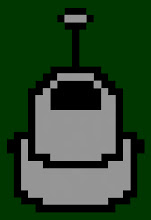
I found a program recently for making my own cursors (see the "Links" section, it's called RealWorld) so I made up a batch of robot based icons and they make me happy. Then I thought that I'd like to make that same lo-bit image, but much larger. I think growing up with Atari and NES nurtured my love of blocky shapes. I'll probably ending up making stickers out of this image. I think it has a real nice feel to it. I just hope that it reads as a robot to someone who hasn't seen my 'bots before. I can never tell what my stuff looks like to people who don't have the benefit of knowing what it's supposed to be first. It's pretty obvious to me that it's one of my bots, but that's because I made it. I think others who have seen my bots would realize that's what it is, but what about those who haven't seen them yet? Oh well, art for Art's sake, I suppose. Of course if Arthur has never seen my bots, he may not know what it is and then he'll say something like "You call that art?"