Showing posts with label stickers. Show all posts

Saturday, January 24, 2009

Bubble-Bot

I doodled this guy while nursing an incredibly sore back:
[click for to make bigger]

I was lying in bed, watching some Flintstones episodes I had taped off of Cartoon Network several years ago. They were using a lot of circles in their promo stuff and it made me want to work with some circles. Now, I'm not that great drawing circles that are round. They're always pretty oblong and mis-shapen. But what can you do? (Practice? Ha!) This drawing is no exception. But I actually like how the "circles" look in this. I can't explain it, maybe it was the pain pills? But were that the case, I wouldn't still like them, and I do still like them. They just work well with this. The shading turned out pretty nice, too. I keep swearing that I'm going to get my pencils out and start working with them again, but then I go and do something like this with a Bic. I like the shading alot. It's very simple, no gradients or anything, but there are at least 3 distinct levels of shading. The lines are simple, the shapes are very simple, why shouldn't the shading be simple, too?

Maybe that's why I like it so much. Simplicity. Things get complicated sometimes and I just dont' want to deal with all that. Classes started up again so work is busy as hell. Equipment failures, annoyed faculty, annoyed staff, annoyed students. Preparing for upcoming terms while putting out the fires of this one. House is a mess. Sub-freezing temperatures and inadequate heat. My girlfriend in Iraq dumped me. Did I mention the house is a mess? Don't get me wrong. Life is not bad. It's just complicated. I don't like complications. I like simplicity. So that's probably why all the simple shapes and lines and coloring. And the robot's there no doubt because, in my mind, robots have it easy. Do what you're programmed to do, that's it. No deviations. Ah, the life of a robot for me!

Wednesday, January 7, 2009

Toasty

I drew the image for this a couple weeks ago and then, since I don't have Photoshop anymore, I threw it into Photostudio 5.5 (which came free with my scanner!) and tweaked it, added the text:

I think that this would make for a pretty cool sticker, wot? Myself, I would assume it's a beverage of an adult nature and therefore quite tasty. One day, when I'm more motivated and less lazy, I'll get this made into a sticker. For now, I'll just pretend.

Saturday, November 17, 2007

Contrast Study #3: OpArt

I like playing with "stroking" an image in Photoshop. (For those that don't know, that's when you make a selection and then create a solid border to that selection, either inside, outside, or centered, at the width in pixels that you decide.) I recently made an action that would select a layer, stroke it at 2 pixels in black, then select the layer with that stroke and re-stroke in white. Then you repeat and you get this:

I think this is real neat. I wish it was real obvious that this was one of my bots to the untrained eye, but I doubt that people who recognize my bots would even see it. Except for the "Robots Are Friendly" around it. I added the text to help point out the robot-ness of the image and to give it a bit of grounding. It was real hard to focus on without that. I might turn this into a sticker one day, but who knows. . . I am lazy after all. I think that if it does become a sticker it would be successful even though it's not obvious what it is simply because it would give people a bit of an optic shock. And with the text there I think some people would think that maybe it means something. It doesn't, but if someone sees it and thinks "This must mean something!" then I'd be extremely pleased.

Tuesday, November 13, 2007

Contrast Study #2: Outlines

This is the second image I did with the blocky-bot. It looks pretty straightforward to me. It's an outline version of the previous image. Duh.


Nothing really new to say about this one that wasn't included in Study #1. I like to work with outlines. I suppose it's another way of making you look at something in a slightly different way. Sort of asking a different part of your brain to define the shape it's looking at? I dunno. This image was the foundation for the one that comes next. Stay tuned.

Sunday, November 11, 2007

Contrast Study #1: Simple Lines

I like to work in black and white and gray. It has to do with the fact that I would like it if things were more black and white, but there is just so much gray that it's hard to understand what the hell is going on sometimes. This is a real simple design, based on the contrast of black of white.


I like the simplicity and I like the contrast. I have done a few things with this same concept. I suppose it's my way of trying to see both sides at the same time. What would this look like white-on-black and what would this look like black-on-white? And which one is "right"? Some will like white-on-black, some will like black-on-white. I need both, it's just easier that way. I don't have to decide anything.

Next installment will be a variation on this same theme.

Thursday, November 8, 2007

Arm The Squirrels.

The university where I work has a squirrel problem. Of sorts. There are quite a lot of squirrels on that campus, but I have not heard of anyone actually being attacked. The squirrels just seem to intimidate people. And since there are so many of them, and they can climb trees, and they cause acorns to fall on passersby's heads, I can't say as blame the people. Animals are crazy and should never be trusted. Especially not house cats. I say this because my cat is pure evil. Which can be fun when people come over, but it can also result in a situation where I'm having to dial 9-1-1 while mopping up blood, and that's just inconvenient.

But enough about the cat. We're here to talk about squirrels.

I like to come up with ideas for stickers. Hopefully one day I will actually get off of my butt and get some made, but until that day I just make the digital image for fun. And here is my latest:


That's the size the sticker would be. Now imagine if you started to see these in a high traffic area like a campus or downtown or something like that. You're walking along, minding your own, and you notice a sticker that states "ARM THE SQUIRRELS." It's not a demand or rallying cry ("Hey everyone! We've got to band together and ARM THE SQUIRRELS!") It's as if arming the squirrels was the solution. Solution to what, I don't know.

I don't think this sticker would go over too well. I think that people wouldn't see it the way that I do (I know! It's hard to believe!) and so they would just be confused or annoyed by the sticker. The best I could hope for is that people would just think of it as some sort of absurdity and snicker and move on. I'm okay with that. But I would like to think that there are people who would see it and think, "Yeah. Arming the squirrels seems like the next logical step. We should get on that." But that won't happen. I base this on the fact that I made a bunch of labels on a Brady label maker that said "Poop." and stuck them all over the place. The few responses that I happened to over hear from people who saw the stickers were things like, "Hey, someone put a sticker that says 'poop' on it on that stop sign!" and I really wanted them to say, "There's poop on that stop sign" or "Careful! There's poop on that door knob!" I guess it was just too abstract. So I have to make stickers that are simple or really cool. I don't think this one makes it.

But I still think it's funny.

Saturday, November 3, 2007

A Change of Plans

Originally this was going to be my sketch-blog. It was going to be dedicated to sharing stuff that I've been drawing in my sketchbook and other miscellaneous pieces of paper. But I don't have a scanner yet so it was going to be a while before it got going.

I've started to do more digital work these days. And I'm starting to mess around with my robots in Photoshop and I even made my own robot cursors. So I'm now rededicating this here blog to my digital work. My goal is to post at least one new thing per week, more if the mood strikes.

For those of you who were all excited to see my sketch-blog, just be patient. I'm still going to do that, I'll just be putting it off until I get a scanner. When I have it up and/or running I'll post the address on this blog and link to it.

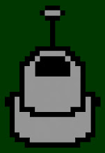
In the meantime, here's an image.

I found a program recently for making my own cursors (see the "Links" section, it's called RealWorld) so I made up a batch of robot based icons and they make me happy. Then I thought that I'd like to make that same lo-bit image, but much larger. I think growing up with Atari and NES nurtured my love of blocky shapes. I'll probably ending up making stickers out of this image. I think it has a real nice feel to it. I just hope that it reads as a robot to someone who hasn't seen my 'bots before. I can never tell what my stuff looks like to people who don't have the benefit of knowing what it's supposed to be first. It's pretty obvious to me that it's one of my bots, but that's because I made it. I think others who have seen my bots would realize that's what it is, but what about those who haven't seen them yet? Oh well, art for Art's sake, I suppose. Of course if Arthur has never seen my bots, he may not know what it is and then he'll say something like "You call that art?"